TL;DR
By choosing new, appropriate fonts HarperCollins is using less ink and fewer pages in their books while maintaining high levels of style, appropriateness and legibility.
The world of book publishing is tough these days. Fewer people are reading, social media is eating away at people’s free time, and bookstores are sadly disappearing. This means that even if someone is interested in buying a book, the competition is fierce. The book has to be in the right genre, written in an appealing style, with considerations for the author’s name and brand, as well as the book cover. These are all factors the publisher needs to think about.
HarperCollins, a leading industry player, understands all this. But the company is now weaving a new thread into its book-selling paradigm: sustainability.
Leah Carlson-Stanisic is the Associate Director of Design at HarperCollins. For her, font selection is not just about aesthetics; it's about capturing the essence of a story. For historical fiction, maybe a font reminiscent of the 1800s; for a technology-focused book, Ms. Carlson-Stanisic might opt for a modern sans-serif typeface. But in recent years, the design team has made these decisions while also incorporating a novel (pun intended!) mission – reducing the environmental footprint of books.
This initiative revolves around strategically tweaking fonts, layout, and even ink usage to optimize page space while maintaining readability.
The results have been impressive: a staggering 245.6 million pages saved, translating to the preservation of over 5,618 trees.
HarperCollins' Christian publishing arm, Zondervan Bibles, played a pioneering role in this sustainability push. Traditionally, Bibles could span over 2,500 pages. In 2015, Zondervan's designers identified an opportunity to reduce paper usage through thoughtful design choices. This led to the creation of the NIV Comfort Print, a compact typeface that significantly reduced the page count of Bibles, saving a remarkable 100 million pages in 2017 alone.
The design team conducted meticulous testing on a voluminous book, creating over 50 versions with different fonts. Their analysis revealed that specific, space-saving fonts could accommodate more text without compromising readability. This led to a curated list of 15 "eco-friendly" fonts for future publications.
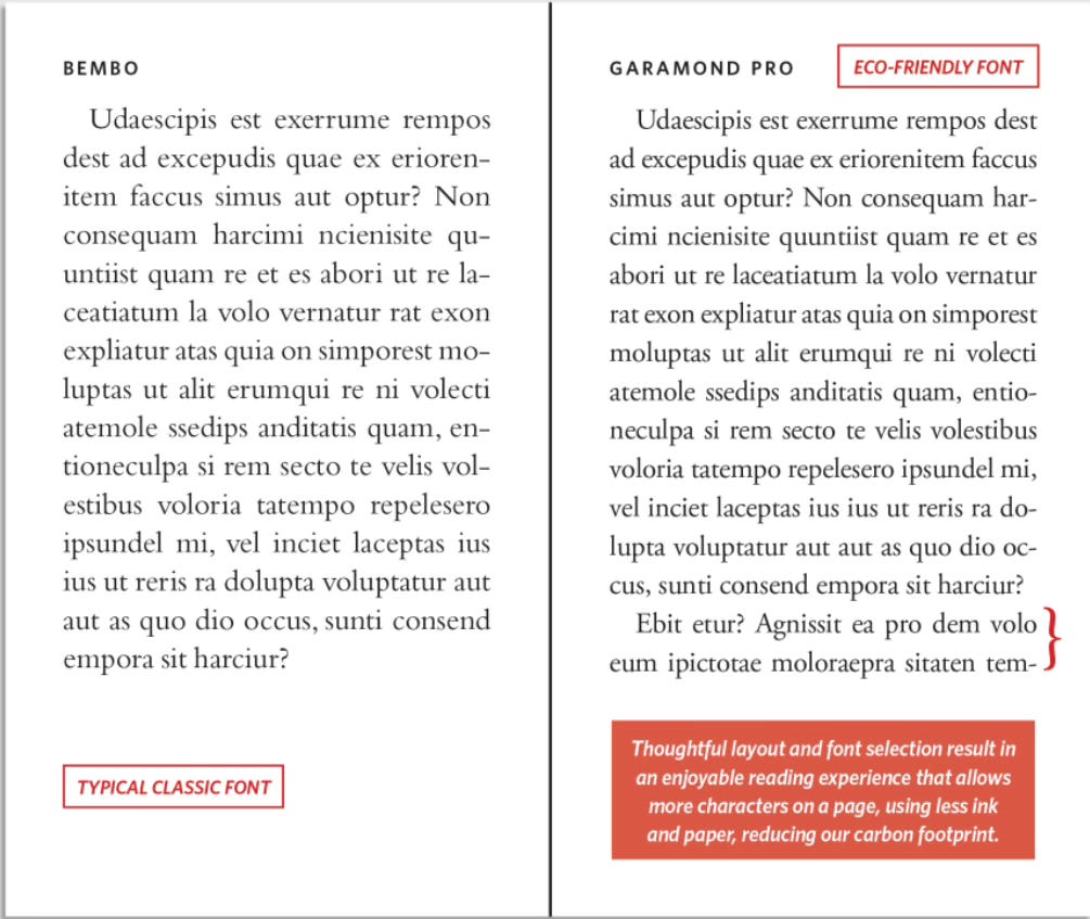
The key lies in a combination of clever font selection and layout optimization that minimizes wasted space. For instance, Garamond Pro demonstrably allowed for more content on a page compared to Bembo, both being classic serif fonts with subtle visual differences.
The process wasn't without its complexities. Take the concept of font weight, which is how much ink a font demands. This has an impact on ink-bleeding onto following pages. Thinking along these lines (pun intended), the team found that Bodoni, a frequently used typeface from 1798, offered an opportunity to increase content density while maintaining lower ink levels and legibility.
This holistic approach led to the selection of fonts that not only minimize paper usage but also utilize less ink, further reducing the environmental impact.
The publishing industry is fiercely competitive, and sustainable practices cannot come at the expense of reader experience. HarperCollins' design initiative deserves credit for showing how innovation and sustainability can go hand in hand.


Fascinating! Who knew? Not me! As long as the font is big enough for me presbyopian eyes to see, I’m delighted for this good thing!