


Being Inaccurate is Good.
For subway maps

If you’ve ever dared trust the Greek public sector and ridden the Athens subway, you would be in for a journey nothing like what was promised.
You may be expecting this:

You will be experiencing this:
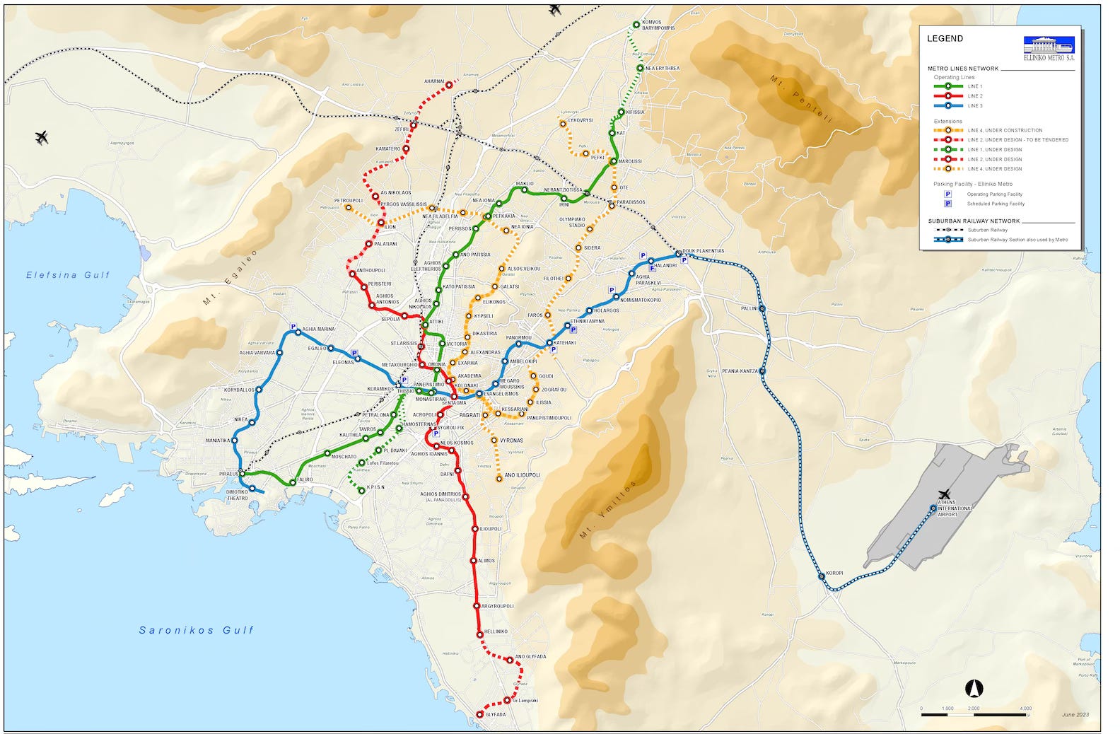
The ride is longer, far more of twists and turns, meanderings and lurches.
Why is it totally unrepresentative?
More importantly, why is this a Good Thing?
One name.
Harry Beck.
More after the paywall.
Why do people ride the London Underground?
Well, it’s famous. It has a cool map (more on this, very soon.) But they ride it because it simplifies life. God knows we need more of that.
The metro is, in many ways, the circulatory system of the living entity that is London. That’s the essence of what a subway is, and that’s what electrical draftsman Harry Beck realized. In 1931, his iconic London Tube map was released, it revolutionized not only how we navigate complex urban transit systems, but made the experience more inviting and intuitive.
Before Beck, the London subway map looked like many others: a tangled mess

Looking at this map, commuters likely didn't appreciate the attempt to represent every twist and turn of the subterranean lines, nor its adherence geographical accuracy. Instead, they were probably confused and terrified. It’s nigh impossible to discern much from this map, but also, it’s quite terrifying. Imagine staring at this map: overlapping subway lines, near 90-degree turns, and rides of terrifying length.
This is not a good map, nor a good user experience. At its core, maps need to convey information easily and, in this case, clearly communicate how the average passenger will be able to get from point A to point B.
This is where Beck entered the scene. Inspired by the clarity of electrical circuit diagrams, he realized that what truly mattered to passengers wasn't geographical precision but rather the sequence of stations and interchange points. He stripped away the irrelevant, presenting a network of straight lines—horizontal, vertical, and 45-degree diagonals—with equidistant stations. This transformation from a territory map to a readable diagram was initially deemed "too revolutionary" but quickly proved immensely popular with the public.
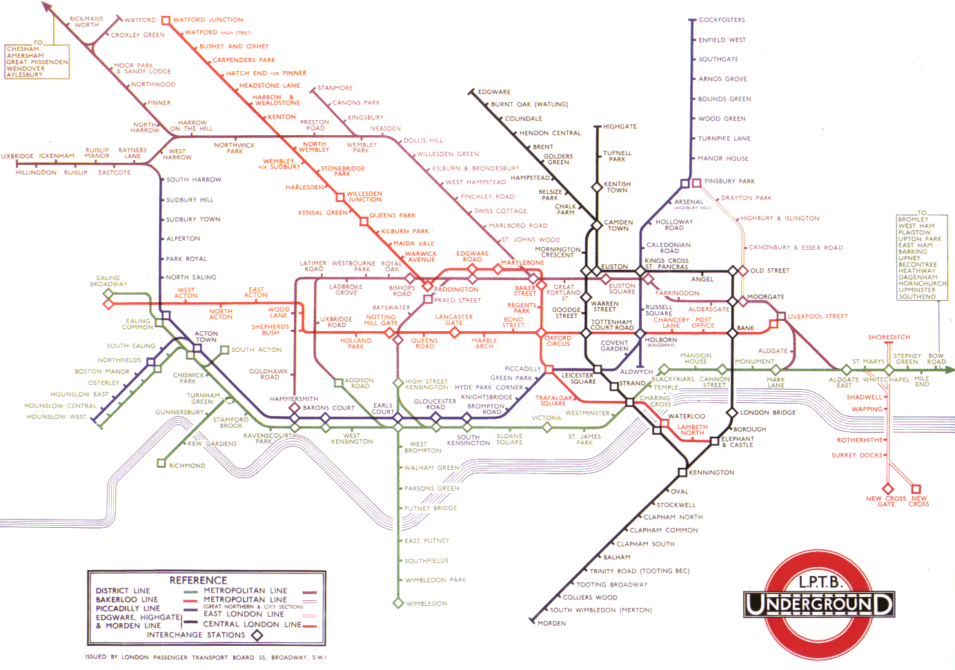
Beck's "less is more" approach worked. It successfully conveyed the entire functionality and complexity of the Tube network while remaining understandable and memorable. Unessential details were discarded, leaving only lines, labels, stations, and the River Thames. This wasn't a reduction of the network's complexity, but a more effective representation – a true embodiment of another great architect, Louis Sullivan's mantra "form follows function."
London Underground ridership demonstrated remarkable growth trajectory since the map's implementation, evolving from approximately 400 million annual journeys in the 1930s to over 1.3 billion by 2019. Research indicates that 89% of passengers consult the Tube map before traveling, perhaps most tellingly, London consistently ranks among the world's most navigable transit systems in international surveys, with Beck's schematic cited specifically as enabling confident exploration of the metropolis.
It’s pretty simple. When visualization removes cognitive barriers, urban infrastructure transforms from obstacle into invitation.
Beck's influence manifested dramatically in Massimo Vignelli's audacious 1972 redesign of New York City’s subway map. Vignelli's map—with its rigid adherence to horizontal, vertical, and 45-degree angles—represented perhaps the purest application of Beck's approach. Yet this was nearly its undoing. New Yorkers, accustomed to navigating by geographical landmarks, revolted (who dare reduce Central Park to a rectangle and the five boroughs into an abstraction,) The MTA capitulated, and withdrew the map within seven years.

But fear not for great design. Vignelli's 'failed' map now resides in the Museum of Modern Art, celebrated as a triumph—a recognition of its ability to distill urban complexity into essential relationships.
Subway maps are topological maps, working because of their simplicity and their manipulation of space, prioritizing utility over precision. This was the genius of Beck: recognizing that visualization is a tool, and an invitation for people to use London’s Metro. The old map was a tool that didn’t work, so he created a better one. And now visual order, clear lines, and strong colors are what we expect when we plan our urban journey, and city life is better for it.
That’s a good thing.